EXPANSION TEAM IN PORTLAND!
The NFL is the most profitable sports league in the world and is still looking for new locations to expand its reach. Portland is a city that has been starving for a NFL team for decades and sports culture around the state is healthy enough to sustain it.
Design Objectives
Build a brand behind a proudly powerful mascot.
Design new logo and word mark.
Design distinctly modern uniforms that will stand out and sell fast.
Create merchandise and advertising that fits the message of the team, as well as inspires a brand new fandom to show up in vast support.
CONCEPTING

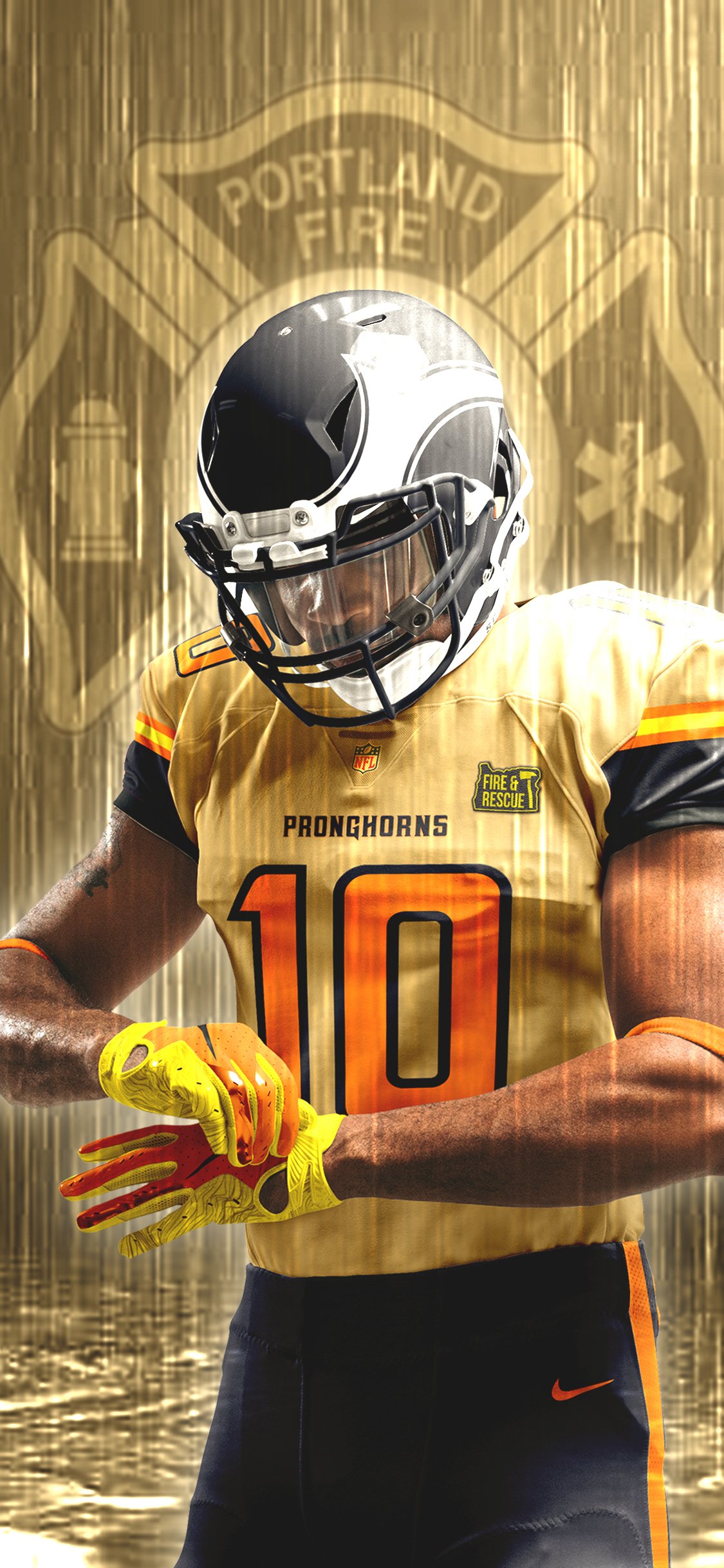
This team’s color palette and mascot are inspired by the uncatchable American pronghorn, Portland’s seasonal landscapes, and its fire service workers. A wild temperament of orange coupled with steely grays to create a stalwart aesthetic in all uniforms and visual branding.

The primary logo combines elements of a pronghorn antler, St. John’s Bridge for the stem, and the letter P respectively. The chosen typefaces combine for readability (Gill Sans) and a sharp serif stylization (Geizer).
BRAND VISUALS

PRIMARY LOGO + WORD MARK
PRONGS HORNS CREATE A PATTERN THAT RESEMBLES FIREY THORNS. HARKENING TO PORTLAND’S NICKNAME AS “THE CITY OF ROSES.”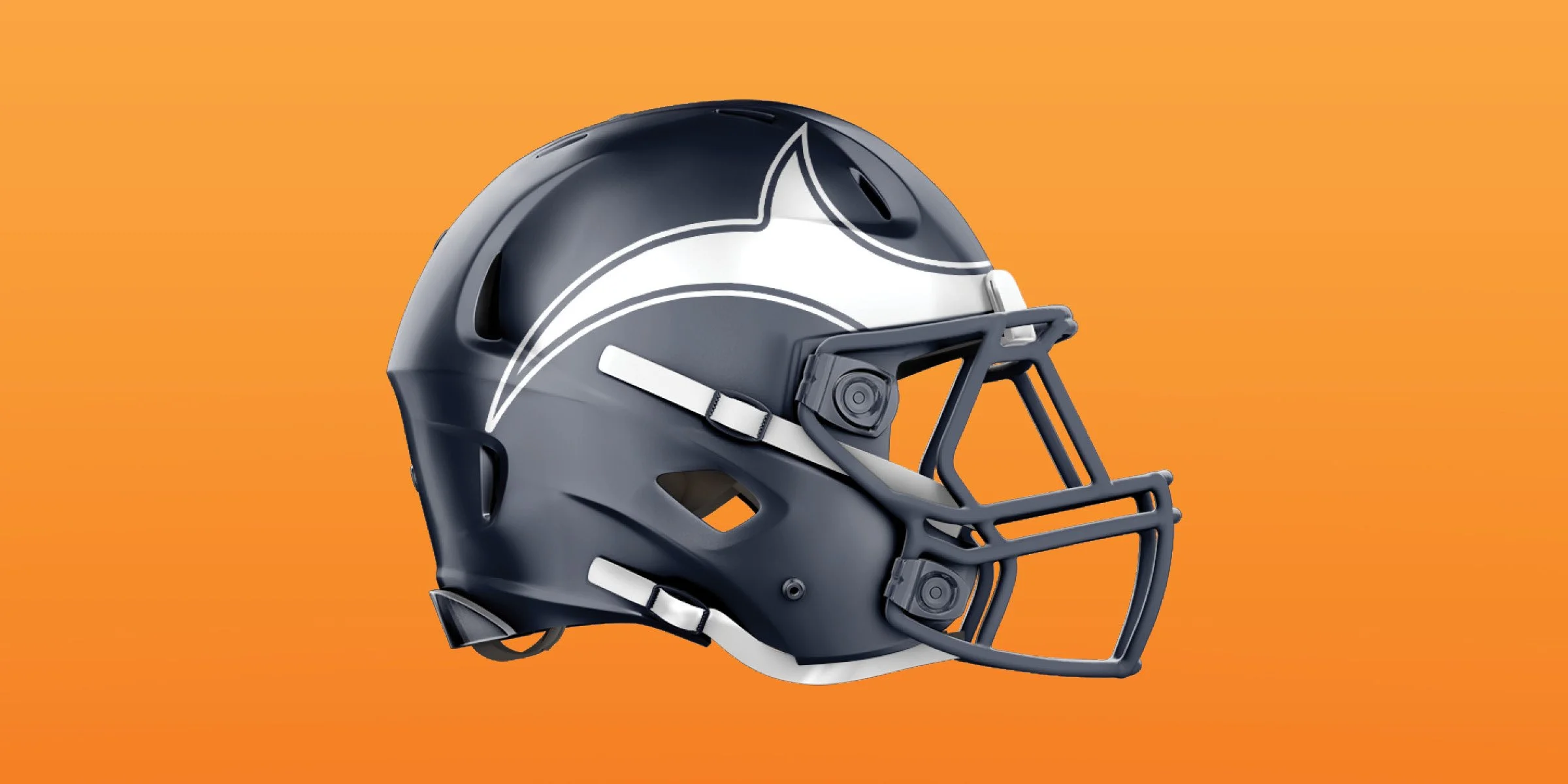
CARBON GRAY HELMET WITH ICONIC ANTLERS
PATCH WORN ON FIRE & RESCUE APPRECIATION UNIFORMTEAM UNIFORMS
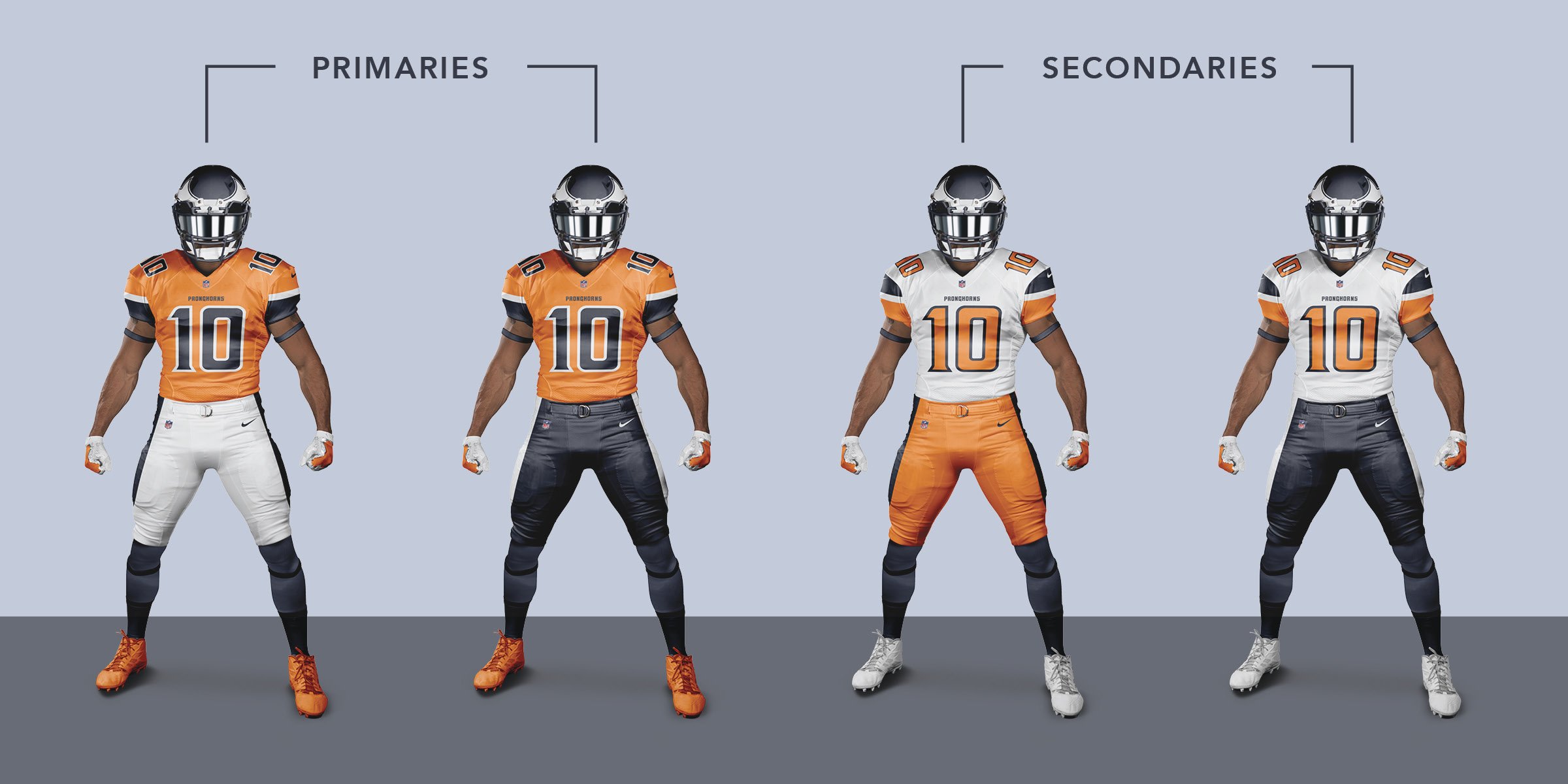


Bold colors with striking contrast to allow each colorway an opportunity to stand apart from one another and increase options for fans.